Issue 54
All issues can be found at: https://geocraic.com/
Please do let me know if you’re hitting paywalls with the links. I try to avoid this or at least notify when there is one.
Subscribe here: https://geocraic.com/pages/discussions.html
World
Economic Geography
Popular Engineering
From Cory Doctorow comes a good article on the engieering and recyle chains needed for a circular system of battery self-sufficiency.
- Pluralistic: Circular battery self-sufficiency (06 Aug 2024): https://pluralistic.net/2024/08/06/with-great-power/
UK
Even the Financial Times is getting into story maps (non-ESRI). Here’s an example from the recent far-right riots in the UK.
Canada
Chilcotin Landslide
I had a post last time about the river-blocking Chilcotin Landslide in Canada. Here a video shows it is being breached.
- Twitter post: https://x.com/watershedlab/status/1820572447965622732?s=46&t=Gc0CFq2K263wdxTiNNzIBQ
- 2.5 Milllion truckloads of debris being flushed: https://www.youtube.com/watch?v=3ZJMAB3Z9Qs
- Chilcotin River a “Beast”: https://www.youtube.com/watch?v=tIZeVo21DA8
US
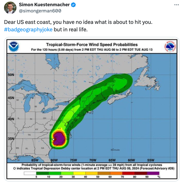
Debby Does What?

Ag Census Geography
New 2022 Agricultural Census Data in ArcGIS Living Atlas.
- Blog post: https://spatialreserves.wordpress.com/2024/08/05/new-agriculture-census-data-now-available/
- Atlas: https://www.arcgis.com/home/item.html?id=577668e9dbf14ddf86bee2c749e065e6
US Election/Poll Result Maps

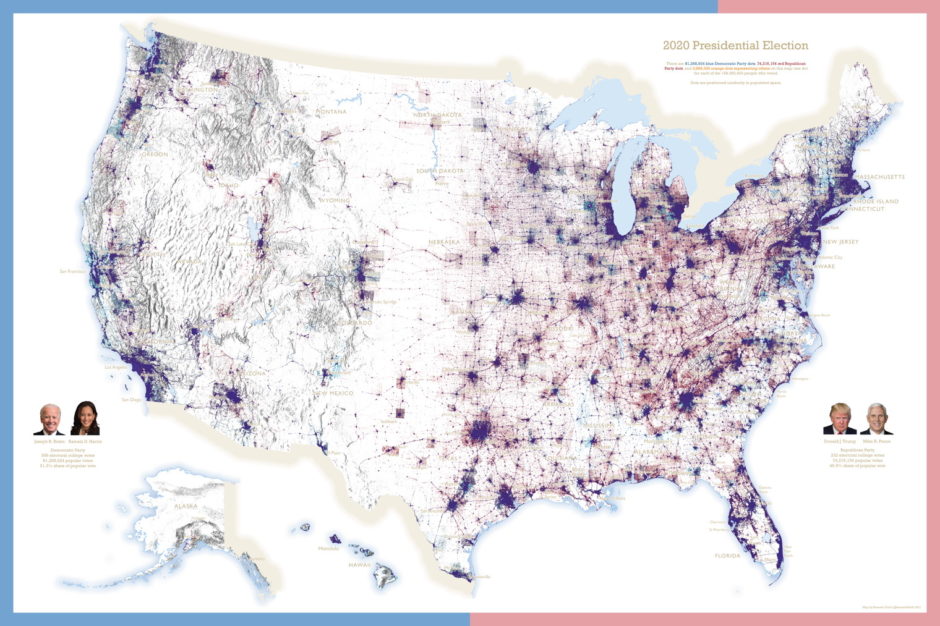
Once again we’re in the season of seeing the misleading choropleth maps showing US election results or poll results. All I can do is sigh. We know there are better ways. Even main-stream-media knows it. But the simplicity of execution for a choropleth always seems to win out. Sigh. As to the caveat that the NYT uses for my favorite, the dasymetric, dot density maps: This map from 2004 seeks to solve the population problem by removing uninhabited areas. But if you are looking for the result in a sparsely populated place, it can be hard to decipher. And it is still difficult to tell who won each state. Why not color code the border by the winner of each state? Sure, there’s some geometry finagling to do to draw an interior line so the colors don’t overlap but it seems a simple way to make the winner of the state clear. I want precinct level dasymetric dot density result maps.
- Good NYT article: https://www.nytimes.com/interactive/2016/11/01/upshot/many-ways-to-map-election-results.html
- Short article from the University of Indiana Bloomington. Which admittedly has one of the worst maps. A choropleth Cartogram. I like Cartograms personally. I think they are unintelligible to normal folk. And with the original sin of the election-result-choropleth added to it - horrible: https://guides.libraries.indiana.edu/c.php?g=1024502&p=7421466
- What the hell is Dasymetric? https://en.wikipedia.org/wiki/Dasymetric_map
- Kenneth Field leads the way: https://www.maproomblog.com/2021/02/field-releases-dot-density-map-for-the-2020-u-s-presidential-election/
- How to do it
- From Kenneth Field’s ArcGIS blog: https://www.esri.com/arcgis-blog/products/arcgis-pro/mapping/experiments-with-dot-density-part-two/
- In QGIS: https://www.youtube.com/watch?v=UlG9kwsbnQQ
- From Anita Graser (aka Underdark): https://anitagraser.com/2012/11/18/improving-population-density-maps-using-dasymetric-mapping/
- Precinct level data: https://redistrictingdatahub.org/data/about-our-data/election-results-and-precinct-boundaries/